Wednesday, 30 April 2014

Kitchen Overhaul Part 2


First things first, inspiration. As you've probably gleaned already, everything done in this house has been done on a budget. Our pot of savings was well and truly drained on our build with all the work required. Replacing and renovating the windows was our biggest expense, costing more than installing and running gas over 3 floors of our property. In a word- ouch.

So, ever the enthusiast I got into gear trying to source an affordable and stylish kitchen. Having never bought a kitchen before, I think we underestimated the costs involved. Given that our kitchen is medium sized, not small but not huge by any stretch, I figured we should be able to find good mid-range units for a sensible price.  It is fair to say that after a weekend perusing all of what Glasgow has to offer, my enthusiasm was waning. The particular turning point was B&Q quoting us £9K for units alone, without any of the 'extras' such as sinks, worktops etc. Now, I realise that kitchens aren't a cheap purchase but my inner diva blanched at the thought of spending well in excess of £10K on a B&Q off the shelf kitchen. 'Hell no', it cried!

(Disclaimer: I do think off the shelf kitchens such as IKEA are a great option in the right property but due to our traditional approach towards the renovation, it didn't seem the right fit for us, particularly as the cost wasn't technically 'budget')

True to form I turned to eBay looking for ex display units or quality used kitchens. I also checked out theusedkitchencompany.com who also had some great offerings. You can get some truly unbelievable deals on kitchens from manufacturers such as Mark Wilkinson, Chalon etc. Amazing really. Both options, I would wholeheartedly recommend if your space is fairly standard. For example, had we required an 'L' or 'U' shaped kitchen to cover two or three walls, I'm confident we could have scored a good deal online. However, this house is sent to try our patience and with a gap for the back door and shallow wall recess to contend with, I quickly accepted that we'd have to pursue a more 'made of measure' rather than 'one size fits all' option in order to get a kitchen which looked coherent and was also a practical use of the space.

I decided to to focus on what kind of kitchen I'd want were money no object. Enter the 'dream kitchen' inspiration board!


This dream offering from is from Martin Moore & Co. I absolutely love his traditional English designs- simple, elegant yet oozing class.

Next up Neptune kitchens. Neptune are actually surprisingly affordable and their products are of very good quality and look really high end.  This manufacturer was tantalisingly within reach but for the number of units I needed the classic 'Chichester' range was still a bit pricey overall.

Finally, this kitchen by Tom Howley. If I could have a 'dream' kitchen, this would definitely be a contender. The look overall is just amazing- well finished, luxurious and contemporary but not over the top. I feel a swoon coming on just looking at it.

So what does one do when on a budget and lusting after top of the range kitchens? Copy them of course! I decided to send these images along with a rough plan of our kitchen to a kitchen joinery firm who make handmade kitchens. There's a lot of choice in this particular area but I noticed one firm offering ex display kitchens at a very keen price and after shopping around for quotes, decided we needed a 'handmade' rather than 'bespoke' job- this distinction seeming slight but actually setting respective price points apart by many thousands of pounds!

I collated all my favourite ideas from inspirational kitchens I'd seen, right down to the paint colour. The units arrived pre-built and painted with hinges of my choosing but no hardware, worktops etc. Here are some woefully poor images of the result once installed and the room decorated.


You can see that my choices thus far were more than slightly inspired by the kitchens above! I decided a larder unit with fielded panelling would make a grand statement but could also usefully conceal the washing machine and boiler in addition providing useful storage. The units were painted Farrow & Ball's French Gray. You can't see them clearly here but I splashed out on polished nickel cup handles which have concealed fixings (so no screw holes visible). They are great quality and I think make the units look higher end- well worth the splurge. Another trick I employed to get the bespoke look on a budget is double height cornicing on the cabinetry so the profile is quite bold as you can see.

The Falcon cooker seems to be popular amongst the high end kitchen manufacturers and I was lucky enough to find this one locally on Gumtree for a few hundred pounds. It has brass detailing which Steve was unsure about. Originally I'd intended to gave polished brass handles on the cabinets which is becoming more fashionable with companies such as Plain English using brass detailing but eventually I decided polished nickel was the way forward. However, I stand by my brass adorned Falcon (which Steve now concedes looks awesome). It totally works in the space and the brass makes it less generic- plus it is a fabulous appliance!

Finally, after much agonising, we plumped for ceramic tiles for the flooring, though they are pretty dusty in the photos above! This was a tricky one as I'm not generally a huge fan of ceramic tiles, preferring natural stone where possible. As budget was a major factor, our choices were limited but it was be tern the ceramic tiles and some textured travertine very similar to the tiles shown in the Martin Moore and Tom Howley kitchen photos above. I really like this look and wanted to replicate it but when push came to shove something stopped me from running with this look. I think my reservations were two fold- firstly that the flat is a top floor Victorian conversion. I tend to feel that these Fired Earth type stone tiles look best in a kitchen leading out to the garden, in a grand house with large kitchen and a slight country feel. Secondly, as we'd knocked through to the Studio, the tiles need to work with the contemporary space and wooden flooring in that room- pitted travertine, however beautiful, just didn't seem like the right fit. However I'm thrilled that we went for the ceramic in the end . They have a crisp clean look and green tones that blend perfectly with the tones in the kitchen.

So what next? A worktop of course! And that is a saga/blog post all of its own. Stay tuned....

Saturday, 15 March 2014

Radiators and windows- the journey to being warm

One of the main projects we undertook in the house (I say 'we', we didn't do it ourselves, there was a plumber involved), was to install gas central heating into the property.

Note: I'm conscious that I always call this place a 'house'. Obviously it's a flat, part of a converted townhouse. However, because we live over multiple levels and have 2 sets of stairs its difficult to think of it as anything other than a little house, which is what most people remark it seems like when they see the flat for the first time. It's a quirky tardis like place- you'd never guess what the space is like looking from the outside.

I honestly can't put into words the pure relief of having heating. We lived in this flat, with it's 3 levels, 18 windows (including original skylights) most in dire need of refurbishment, for nearly 5 months before the pipes were all laid, boiler installed and gas connected. That's a big drafty space to occupy in winter, trust me. So as much as we were thrilled to have the house and take on the project, the freezing temperatures inside the flat made living here pretty difficult at times.

As I recall it was about 3 months after we moved in before we got the windows repaired and replaced where necessary. A couple of the original sash casements were literally hanging on for dear life, causing big gaps between the frames and allowing the indoors and outdoors to unite in their sub zero temperatures.

So it was a great day indeed when the new windows came:


Before- note gap in top right hand corner where sash had slipped.

After- shiny new windows.

Big improvement, right?

We knew we'd need to install gas central heating. Meantime, we had the existing electric panel heaters- the only source of heating in the flat. Unfortunately with the costs of the build, we struggled to justify turning the heaters on due to their inefficiency and high bills associated with use, particularly before the windows were restored/replaced.

A view into our bedroom- living the dream!

The next thing we had to think about was the positions of radiators. Not as easy as you'd think. On one hand there is a great freedom having the option to start from scratch and choose where everything goes but on the other hand it's tricky to have the responsibility of choosing firm positions for radiators, power points etc. I guess when you move into a house under normal circumstances, you take for granted that radiators etc are in situ- they just are where they are and you work around them. So we had some lengthy discussions about the placement of radiators which required some serious vision as to how we'd use the space, where we'd put furniture etc. Luckily, I think our gut instincts on placement turned out to be correct.

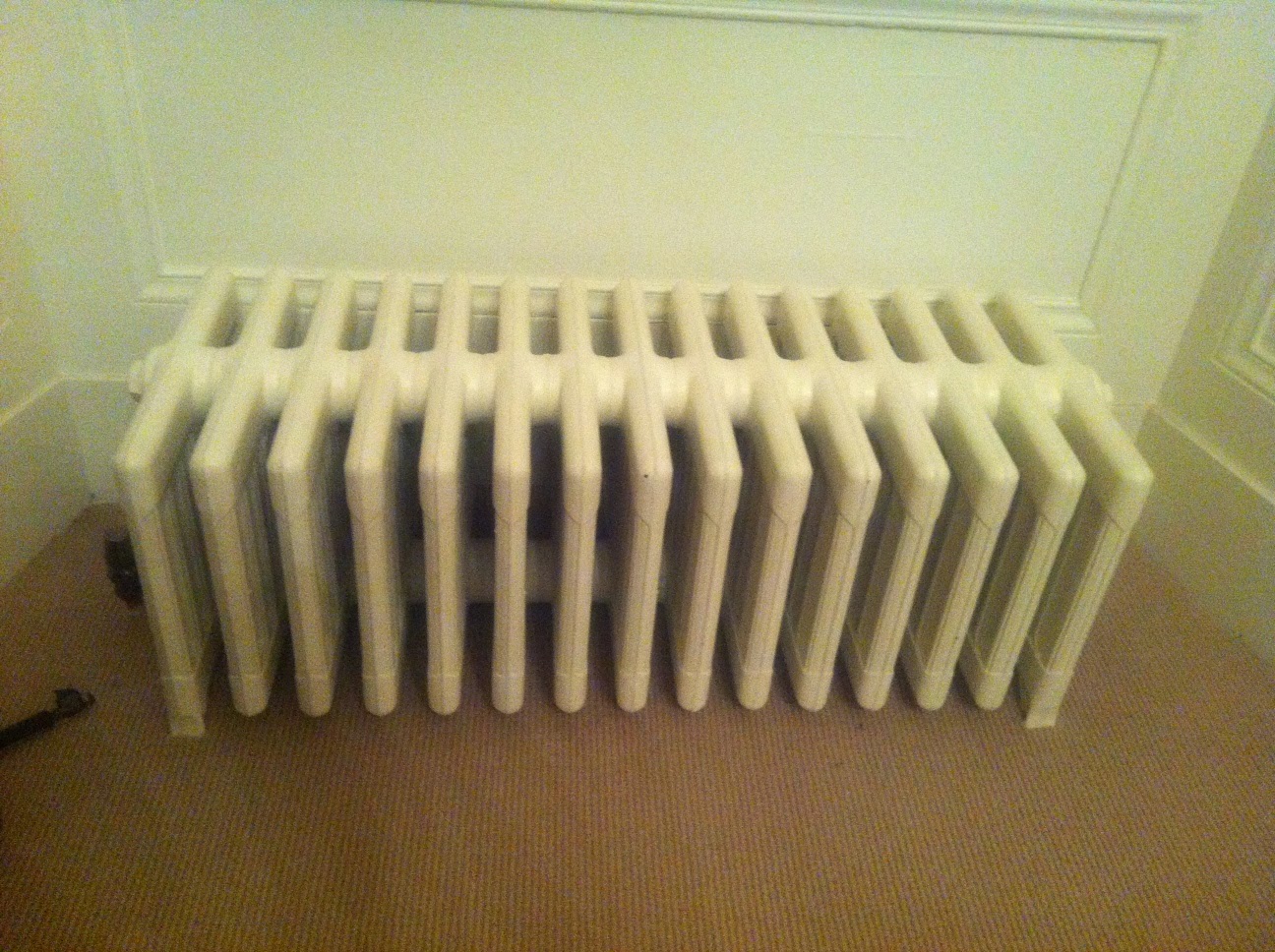
Next, we had to actually buy radiators. Our builder suggested flat panel radiators which are the 'norm'. However I'm not a fan of flat panel rads in older properties and we were determined to restore the flat as sympathetically as possible. A family member suggested the Acova radiators that are sort of replica cast iron available at B&Q etc but to my mind they look a bit shiny and plasticky and actually aren't that cheap so having considered all options, we headed off to the salvage yard to check out reclaimed.

Despite being Glasgow based, we ended up purchasing most of our wonderful radiators from EASY (Edinburgh Architectural Salvage Yard). The reason for this is that most of the ones in Glasgow are not yet restored and get sent off to Edinburgh for testing and priming etc if required. We decided to cut out the middle man and go to Edinburgh where the rads are already paired in their respective sizes, properly flushed through, refurbished and primed ready for painting. The lazy mans choice arguably but the ultimate costs were comparable so it made the whole selection process a lot easier than crawling around Glasgow Salvage yard selecting our options from an inaccessible pile. I should say however, that we bought some other items from GAS and they are brilliant. 

As an aside, it's important to calculate the required BTU to make sure that the radiators you choose will adequately heat the room. We'd already done this and chose our rads according to their 4 bar width and appropriate amount of sections. I love the aesthetic of the 'ribs' on these radiators- they are so sculptural and beautiful which is why we were so determined to buy reclaimed. Once delivered, some serious manpower was employed to carry each radiator from the ground floor of the building, up the flights of stairs and into our flat. To save costs and to ensure the rads were evenly painted before installation, we decided to paint them ourselves using graphite grey spray paint:


And here is Steve in action painting them. He's trying to look like a 'hoodie' on purpose- I indulged him. Cue some artsy shots:

A couple of the radiators we needed were odd sizes to fit a particular space, so we restored those ourselves.

Radiator for kitchen being sanded back.


We then had to select valves for the radiators. I chose traditional style wheel head valves but in a contemporary black nickel finish to match our light switches and sockets. Not the cheapest option but then there's no point cheapening the overall look with plastic valves in my opinion.

Some of the radiators we painted remain this graphite grey to blend in with a colour palette of blacks and greys. However, when it came to picking colours for the rooms, some of our paint choices weren't necessarily the most harmonious match with the grey- for example in the bedrooms. So we decided to invest in a paint gun and repaint some of the radiators in Farrow & Ball eggshell to tie in with the woodwork whilst the rooms were still at the undercoat stage. It was so much quicker and easier using the paint gun- a Black & Decker brand picked up relatively cheaply from a DIY store. I'd recommend this option if you're considering painting radiators or large piece of furniture!

Here is the end result in our living room. I think we made the right choice (sorry for poor quality iPhone pics):


And a special radiator  in the bedroom- great for sitting on to warm up whilst looking out the window admiring the view!

I remember vividly, maybe a week after the heating was installed, sitting in the living room just before Christmas with a jumper and big furry gilet on. Our plumber walked in and said 'why are you huddled in here?', to which I responded, 'It's cold!'. 'Put the bloody heating on'! he exclaimed and we both started laughing. I guess having gone without for so long, it seemed a bit alien to have heating on tap as it were.

More than one year on and I'm pleased to report that whilst our flat being an old building still suffers the usual chilly evening here and there, it's generally a lovely homely, cosy place to be.  Job done!

Tuesday, 25 February 2014

Catching Up

I've been a bit lazy, neglecting the blog these last few weeks as I've been tied up with other projects. However, progress continues apace and we're finally getting into the spring cleaning state of mind, sorting out and finishing jobs that have been put off far too long!

One such task I've procrastinated over longer than I'd like, is getting stair runners installed on our two flights of stairs within the flat. Ever clear on what I want, runners were purchased a few months ago from the wonderful Roger Oates Flooring. For those unfamiliar with this company, Roger Oates stock a range of traditionally woven flatweave, Wilton and wool runners and fabrics. I opted for these fantastic flatweave runners that I've long lusted after in design magazines, seduced by the sophisticated herringbone weave and classic colours.

Images courtesy of Roger Oates
First off, I realise the runners are different. The main reason for this is that our stairs are two different widths due to the first run being part of the original common staircase which became integrated into the flat following the 1950's conversion. Not all styles are available in the wider width necessary to cover this run, at least not off the peg by the meter and we werent inclined to pay a huge amount for a custom order, given the runners are at a high price point already. Hence I selected two different styles but on the plus side, they define the entrance hallway to the flat from the second flight of stairs up to the top floor which is more within the main body of the living space.

The flaw in the plan being that Roger Oates are based down south and in line with this, demand for installation of their products seems to also be firmly south of the border. As we'd purchased directly rather than from a Scottish stockist, the hunt for a qualified fitter was an arduous task. Luckily, we eventually prevailed and found an excellent fitter to do the job at Millers Flooring. Here are the results:


There's still some work to do in removing the stair rod brackets from the second run and touching up paint on the stairs generally to tidy things up but all looking good so far!

On another topic, being very much into all things interiors, I tuned in to BBC 2's Great Interior Design Challenge. I very much enjoyed the series, despite agreeing with some of the critics observations. In particular, I was pleased to see Timorous Beasties designs being used in several of the projects. It's no secret that I'm a big fan of this Glasgow design house and have used no less than three of their wallpapers in our redecoration so far! Very chuffed to note that Luke Watkins from GIDC seemed to have read my mind by creating a very similar feature using Timorous Beasties 'Pheasants' paper. We used this paper to cover the chimney breast in the master bedroom, accenting the French style furniture and Farrow and Ball paint we chose. I think it's really effective- we particularly like the way our decorator split the paper to have one of the birds peeking out above the picture rail!


Here is Luke's design:

Image courtesy of Luke Watkins

Our feature chimney breast came first of course, being completed last summer! As you can see, he used a very slightly different colourway (ochre and blue) which is lovely. I consciously decided to go with the grey tone instead as there is already quite a lot going on in the bedroom with the blue Delft tiles, marble and of course our ornate furniture etc, so I wanted to keep the colours simple and not assault the senses with too many colours/patterns at once! I also purposefully took the wallpaper above the picture rail right to the ceiling to draw the eye up, which personally I think works really well as we have such a lovely cornice in this room. I do like how Luke used the Chinese style pottery that his clients already owned within his scheme. I plan to pick out the blue in our fireplace using textiles and ornaments- currently on the hunt for some fabulous ginger jars! I'm the first to admit that white and blue with very rich cream perhaps aren't natural bedfellows but the devil is in the detail and I'm confident that once the room is finished it will pull together well.

Monday, 6 January 2014

Spring Cleaning

Happy New Year!

We have been on hiatus over the Christmas holiday period. Now back and ready to take this place to the next level!

Christmas tree and decorations came down today. Thoroughly depressing, especially how quickly it all comes down after hours labouring to put it all in place to begin with. The upstairs living room is now looking decidedly minimalist.

And everything is covered in glitter. Covered. Soft furnishings, carpet, coffee table, fireplace all adorned in silver sparkle. I'm not even that into glitter. This is testament to the fact that Christmas decorating has the ability to send a sane person delerious and why it is only proper that Christmas must eventually come to an end. I anticipate the glitter will haunt me for several weeks.

Now that festive adornments are banished to the attic, my attentions are once again turning to interior decorations and picking up key pieces in the January sales. There are some fantastic bedding deals to be had and I snapped up this linen mix valance in the Zara Home sale:


I love the look of linen valances but they are so expensive. The one at Oka I had my eye on was nearly £200 so this linen and cotton mix one is a worthy compromise.

I'm currently on the look out for blankets to create layers of texture on the beds. I particularly like the idea of using a Morroccan wedding blanket or handira as a bedspread.


I love the texture and sparkle. These are often used as rugs but look really effective as bedspreads. A great investment I think as it's such a versatile piece. They can be expensive online so perhaps a trip to Morrocco to buy one in the souk is in order? What better way to justify a holiday!

Speaking of textiles, I am all over these 'Ludde' sheepskins from Ikea at the moment. Normally £30, I got them discounted with the Family Card for £22 each (how rock and roll am I, eh)!

I know what you're thinking; 'Sheepskin? Yuck.' And previously I would have agreed with you. For a long time they evoked images of lonely-too-small-rugs adorning the floors of dated unloved homes or, worse still, your granny's house. Nevertheless, I'm converted. When grouped together or draped over a chair they look fab and have somehow gained a new lease of life and popularity thanks to abundant use in chic Scandi homes.

These sumptuous sheepskins looked the part at Christmas time but I can see them being useful all year round for sofas, chairs and use on beds. They had some nice taupe coloured skins too. I'll probably invest in the larger sizes when we have some spare cash.

Sneaky preview of the progress in our Studio living/dining room

I was never a huge fan of Ikea but they have really upped their game lately, seemingly taking note of the big blogging trends and even creating new ones with their slick contemporary prints like this rug (see above) which we have bought in both large and small sizes (though the large is still in it's packaging-we got the small second hand cheaply- I can't face using the bigger one yet until the floor is finished as everything is still dusty)!

I think that's all for now... I'll do a devoted post to our Studio which you can see in the picture above. It's far from finished but we managed a quick revamp just before Christmas which has cheered the place up a bit. You can see the before here.

Most import New Year's resolution- no more builders in 2014. Yay!


Tuesday, 17 December 2013

Fireplace Woes

We are very lucky that our flat has many gorgeous original features. In fact one of the main features that caught our eye when we first viewed the property is this stunning marble fireplace with Delft tiles.

 A fairly simple design, it's not as grand as it's drawing room counterparts elsewhere in the building but personally, I'd take a marble fireplace over a wooden one any day. It's such a stunning material and one which over the course of our renovation, has now been utilised in different spaces within our home (perhaps subconsciously inspired by this very fireplace)!

Ooh shiny!
Gorgeous Delft tiles

Isn't she a beauty? The fireplace in the living room, by contrast, was lacking in lustre!

What could make the 50's tiles even better, you ask? Stick on metallic horoscope tiles, that's what!

It's difficult to make out but the fireplace had been boarded up and re-tiled meaning the original Victorian tiles were long gone. The first two things we did on the day we took entry of the flat were to rip up the sunflower carpet in the living room and take a hammer to the bricks in the fireplace. Step one of 'project fireplace' complete. 

The re-tiling of the fireplace probably occurred in the 1950's when the building was converted into flats as the crackle glaze tiles are reminiscent of this era. At some point the fireplace surround had also been painted. Not ususual. However, we had an inkling that something might be lurking beneath the layers of paint and as people who like to get stuck in, true to form, we took a run at solving the mystery!

You should always wear a face mask and allow ample ventilation when using paint stripper. Clearly, I have a death wish.


Armed with a vat of paint stripper, some rubber gloves, a paintbrush and a wallpaper scraper, we set to work. First of all, we painted thin layers of Nitromorse (paint stripper) onto the top layer of paint. This causes the paint to bubble and blister, so it's easier to scrape off (note that 'easier' is a relative term).

You can start to see what we uncovered underneath- marble!


Unfortunately, we also uncovered layer upon layer of paint including at least one layer of black paint which, when the Nitromorse was applied to it, turned into a sticky gooey tar-like substance, nigh on impossible to remove. Unlike the other paint, which became slightly rubberised in texture and peeled off without too much effort, this black muck clagged up into tar and became stuck to the scraper, the fireplace, our hands, smearing sticky gunk over everything it touched. Yummy.

In case you weren't sure, I can confirm that this is an extremely messy job!

What should have been an afternoon's work turned into an epic paint stripping marathon which went on for so long that in the end we gave up until the imminent re-decoration gave us the push we needed to tackle it all over again. Not recommended.

Buoyed by the relative progress, I also tried to prise off one of the yellow tiles with the scraper to see if there were original tiles underneath. There were not. However, in my vigour (ok, brute force) I managed to make a bit of a mess of the existing tiles by breaking two of them. In fairness the removal of the eclectic horoscope and other assorted tiles (which had been stuck on by the previous owner) didn't help the cause. 

The tiles looked awful and with the painter about to start, I knew I couldn't have the room decorated without first addressing the problem.

With funds depleting into the renovation and enthusiasm waning, I decided there was only one thing for it- spray paint! So we now have a lovely marble fireplace surround with battleship grey spray painted tiles inside it- how's that for a contrast!

It kills me to note that there are still areas of black paint on this fireplace in the hard to reach nooks and crannies that no amount of elbow grease will remove. Deep breaths!


The next step is to find some Victorian reproduction tiles which we'll have laid on top of the existing ones. This actually shouldn't be an expensive job but it's something I'm taking my time with because I feel a responsibility to put something in which, while not original, will be appropriate for the space. I know there will be those purists who like the retro tiles and abhor the fact that I've covered them in cheap paint and in a mid-centrury modern home, I can see that. However, throughout this project we have tried hard to preserve the period features and re-instate them where they have been removed so I am working with that constantly in my mind. We're not trying to be radical, just faithful to the history of the property.

Perhaps in another 60 years time, someone will even mistake the reproduction tiles I install for original? Who am I kidding- they'll probably paint the whole thing- surround and all- jet black and kick start the cycle once again!


Christmas Past and Present

Today is the anniversary of a landmark moment in our development. Exactly one year ago today, we finally got central heating. After nearly 5 months of progressively becoming colder as the seasons changed, by December 17th it's fair to say we were ready to kill someone- the builders, the gas network, each other. If only those frozen fingers had the ability to grasp! 

Sometimes it feels like one step forward and two back but putting up the Christmas tree this year inspired me to look back at last year's effort and I realised just how far we've come in that time.

As you can see below, we'd tried to make the living room as homely and cosy as possible. It's definitely eclectic...

Our inherited and hideously in-efficient electric fire taking the edge off. Yes there are 2 sets of bath taps in this photo. Best not to ask!
Watching Eastenders 'cause we're classy like that. 

Fortunately, this summer we enlisted the services of a fantastic painter/decorator so the room is now a much more pleasing shade. 

As you can see the sunburst mirror is still occupying pride of place. As for furniture, we're just using what we have at the moment so it's not ideal or perfectly matching but carpets, cleanliness and festive decorations are making the space a joy to occupy in stark contrast to previous months!
Oka coffee table still going strong. You can see the fireplace has been painted. More on that to follow.
The infamous dresser in it's new home. The ridiculously large but supremely comfortable Andrew Martin sofa is destined for downstairs. Once we get some new streamlined sofas and have undertaken the necessary graft, the dresser will be shown off to it's full potential and hopefully won't seem so boxed in.
One new addition, my glorious buffet console (ignore the unsightly plugs). I decorated a plain wreath for a bit of pizazz.
'Whare' was a gift from a relative in New Zealand. It means 'Home' in Maori. Rory Dobner tile displayed under dome.

Next on the agenda is to get some blinds installed. As you can probably tell, we have a high tolerance for making do. Last year one of the sash windows had a 4 inch gap at the top, so the gale howled through into the room making for some bracing evenings. Blinds are seriously the least of my worries!

Hopefully these photos illustrate some positive progress. Lots still to do but it's moving in the right direction!